Thank you for taking the time to help me with the “User Testing” of this Digital Rough for my Screen Design & Graphics course at the Art Institute. Please provide your comments in the “Leave a Reply” at the bottom of this page in response to the 7 User Testing questions. Note that user testing will run through March 21, 2016.
Recommendation
The website for Yale University’s School of Art (art.yale.edu) is in need of a makeover. As the first professional fine arts school in the United States, this school really deserves a professional web presence. The current site has many issues that need fixing:
- Readability – The current site is mostly updated by students with tiled backgrounds and outlandish images making it hard to read or know what to look at on the site. While it should have capabilities for students to contribute, the readability should be maintained for a professional site.
- Mobile Users – The current site does not scale for mobile devices, which are the primary means for their target audience to access the site.
- Social Media Integration – The current site has no social media methods in place to extend the reach of the posts beyond itself. Social media are critical with today’s students.
- Yale Branding – The current site does not look like a Yale University site and should have a more professional appearance.
Style Guide
Design Rationale:
The color pallet for the website redesign of Yale University’s School of Art will have three primary colors of Red, Yellow, and Blue. These are the three colors in the School of Art’s logo.
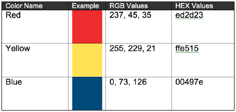
Color Chart
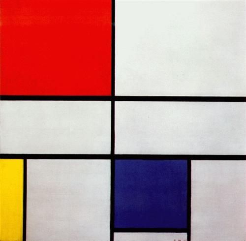
These colors also happen to be very close to the colors from Piet Mondrian’s Composition with Red, Blue, and Yellow. These school colors will be established as a found for the style of the website and be integrated into both the navigation and page elements. These choices and styling of visual elements will lend personality and uniqueness to the Yale School or Art. We also look to include visuals and pulled quotes of several historic artists and designers into the backgrounds of the pages to echo the thoughts of people who have forever made their mark upon the world of art. Content uploaded by registered students, faculty, and alumni to the site may include text, photographic, and graphic elements in full color, which will be laid on top of the existing page template designs. Specific guidelines are provided by Yale University on its identity as shown at: http://identity.yale.edu. The primary elements that will be used from the Yale Identity are the following logos:

Yale Logo Blue
Yale University School of Art logo
Typographical Scheme
The type used on the site will include two primary fonts, Georgia and Open Sans, with the Serif font Georgia being used for large text like headers and subheads. The Sans Serif font Open Sans will be used for all other text. While we will allow students to upload elements to include with their posts, we encourage them to use similar fonts to help maintain a professional appearance on the site. Here are examples of the fonts for use on the website.
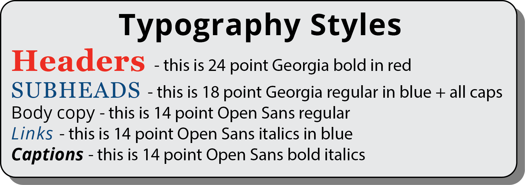
Typographical Style
Image Scheme
The school’s website will require caption information for all photos and graphics uploaded with posts. Captions will only be used for hover text which comes up when you hover the mouse over the image. This alternate text provides descriptions for people with disabilities as well as those using text-based browsers. Here is an example of hover text.

hover text
Current Website
This is a recent screen capture of the current website to show what it looks like.

Yale Art Front Page
Homepage on Computer
This is what the main entry page would like on a laptop or desktop computer.

Laptop version of Redesigned Homepage
Interior Page on Computer
This is what an interior page (History) would like on a laptop or desktop computer.

Laptop version of Redesigned Interior (History) Page
Homepage on Mobile Devices
This is what the main entry page would like on mobile (iPad and iPhone) devices.

iPhone version of Redesigned Homepage

iPad version of Redesigned Homepage
Interior Page on Mobile Devices
This is what an interior page (History) would like on mobile (iPad and iPhone) devices.

iPhone version of Redesigned Interior (History) Page

iPad version of Redesigned Interior (History) Page
7 Questions for User Testing
- What is your initial impression of the website? What first comes to your mind?
- What kinds of things do you think you would be able to do on this website?
- Do you like the Piet Mondrian grid style menus on the left side of the computer version or would you prefer the top right menus used on the mobile version be used on the computer version as well?
- What adjectives do you feel would be appropriate to describe the overall qualities of the website?
- What feedback can you give on things that might improve the overall experience of visiting this website?
- How do the colors make you feel on this website?
- In what ways do you see this improving from the current website?

You must be logged in to post a comment.